How to Make a Small Room Look Bigger

Dawn S • February 28, 2023

Help is here to make your small room look bigger!

Do you have a small room that you would like to look bigger? With these Hamilton home improvement ideas, help is here to you make your small room look bigger!


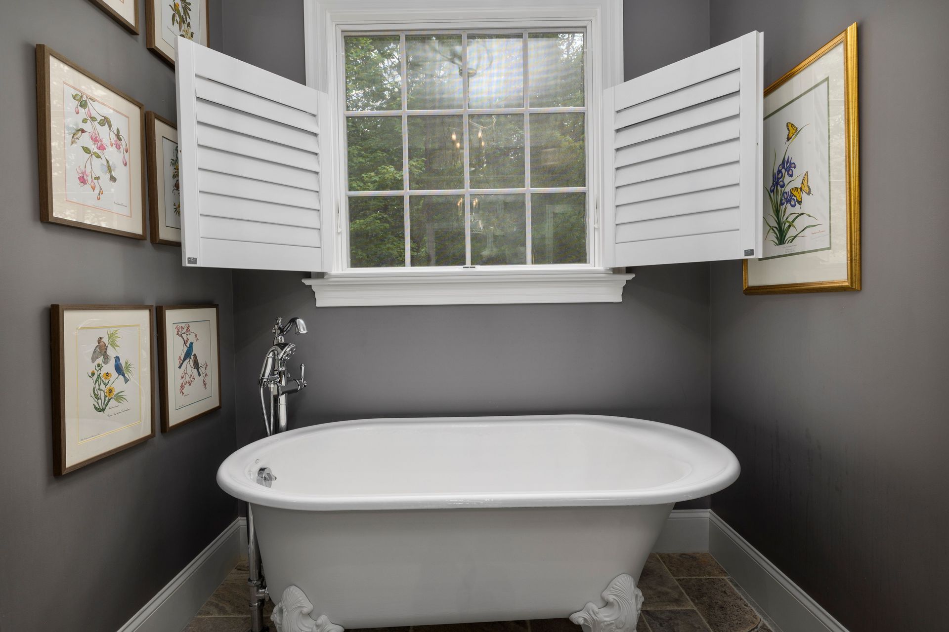
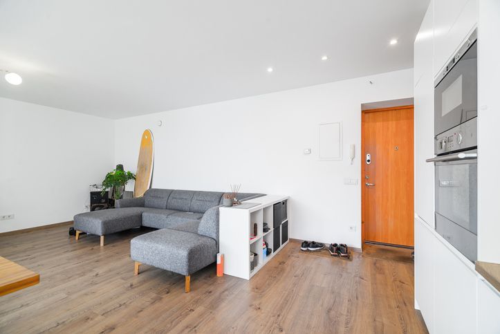
Keep the windows and floors clear. Meaning, there’s no need for drapes and rugs. If the windows need to be covered, use blinds that are not bulky and will just serve the purpose of covering the windows. Make sure the blinds will let in the sunshine and light during the day to brighten up the room. Using rugs will add to the clutter of the room, so a great idea is not use them. Rugs will add an unnecessary pattern to the room. If the room carpeted floors, be sure to choose a light colour. 


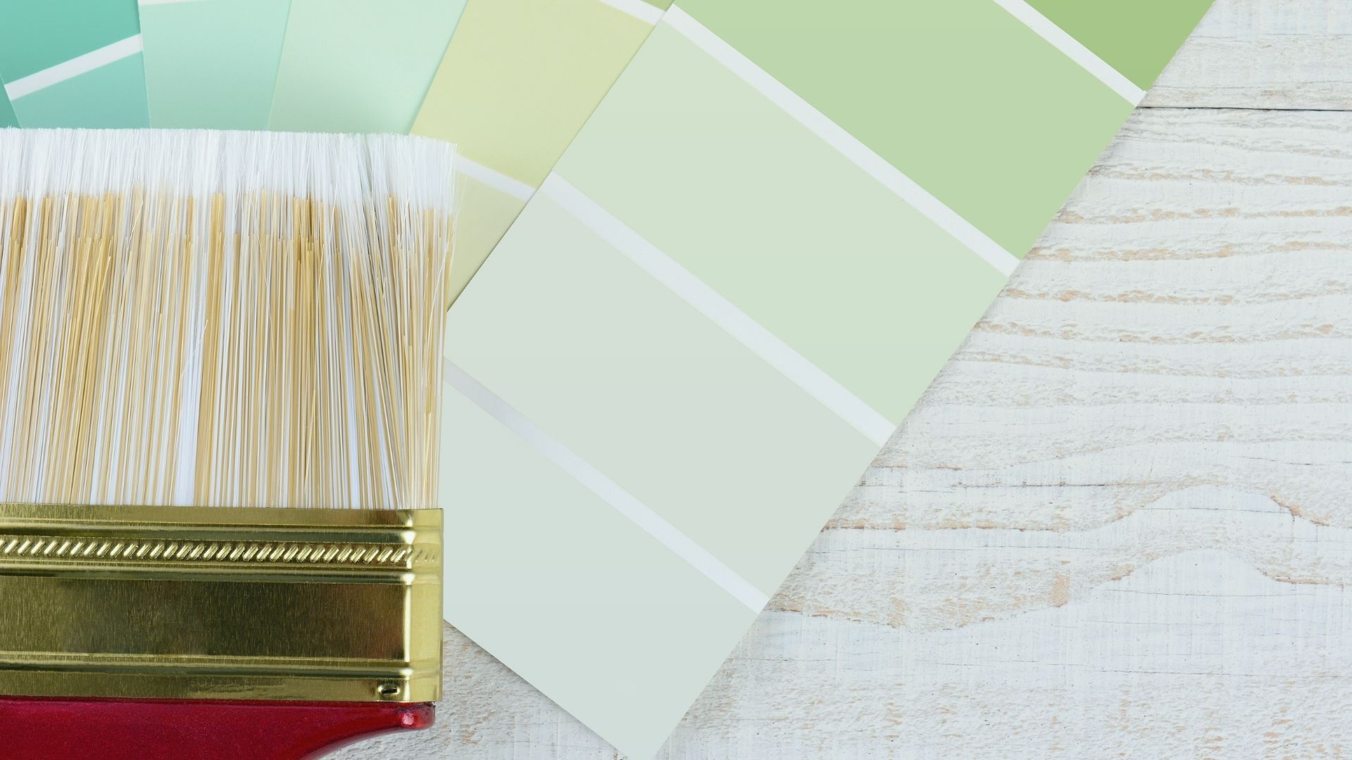
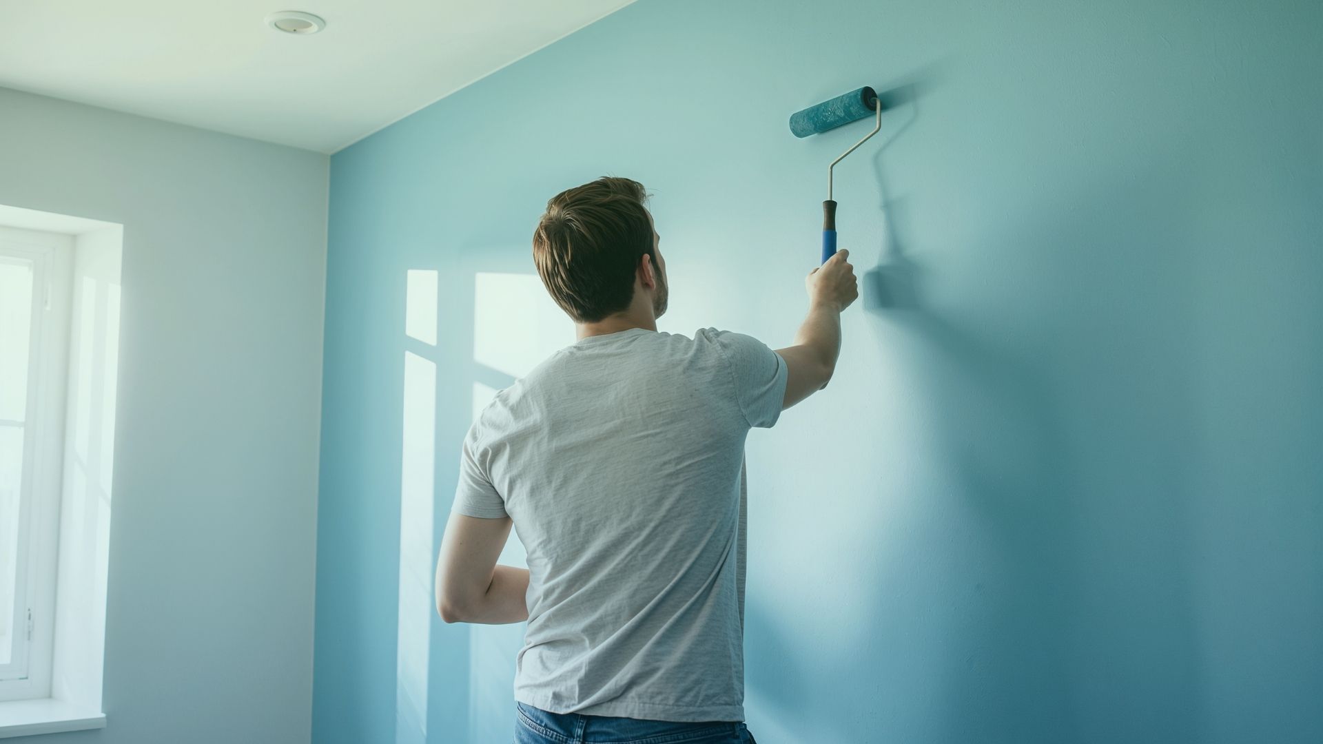
Speaking of colour, use a neutral colour scheme with cool colours. Cool colours are light blue and green as they can be light and airy while being calm and relaxing at the same time. Warm colours like red, orange and dark yellow are cozy colours but they seem to close a room in and make it feel smaller. If you want the furniture to have colour, look for cool colours with no or minimal pattern as you’re thinking about your small room décor.


Your furniture choice is important and should be well thought out. It’s best to avoid heavy, bulky pieces that will take up a lot of the floor space. Perhaps choose a loveseat, sleek couch or a couple of comfortable chairs. If you’re going with a couch with a matching chair, take note of their size. When you place the furniture, be sure to leave space between the furniture and the walls all while making sure there is room to move around the space. Some designers are of the mindset that your furniture should be lower to the ground so that more wall space is exposed. Just think of who will use the room. Furniture that is too low may not be convenient for seniors or those with disabilities.

When accenting your small room décor, mirrors are a great choice to mount on the walls. They reflect the light which make the room feel more open. When hanging anything on the walls, be sure not to hang pieces too high. Basically, keep them low because that will lower the eyes and make the wall feel larger. The main challenge of with Hamilton home improvements in a small room is to avoid anything that takes up space on the floor and on the furniture. The beautiful overstuffed cushion that has caught your eye will take up room on your couch or chair and end up on the floor when company is visiting. If you feel need a coffee table or end table, choose glass so that the floor is visible. This another way to trick the eyes into thinking the space is bigger. With small room décor, there is always room to improve. 


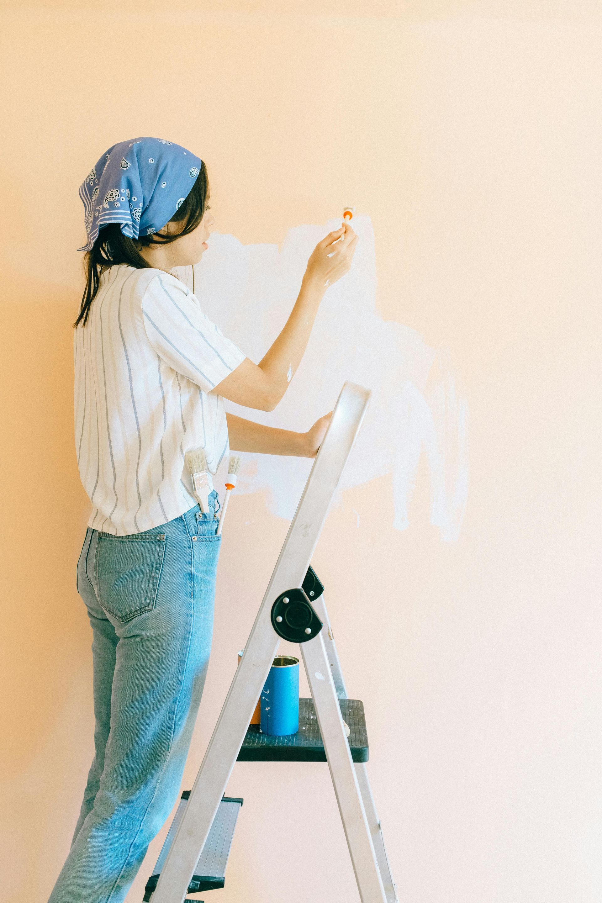
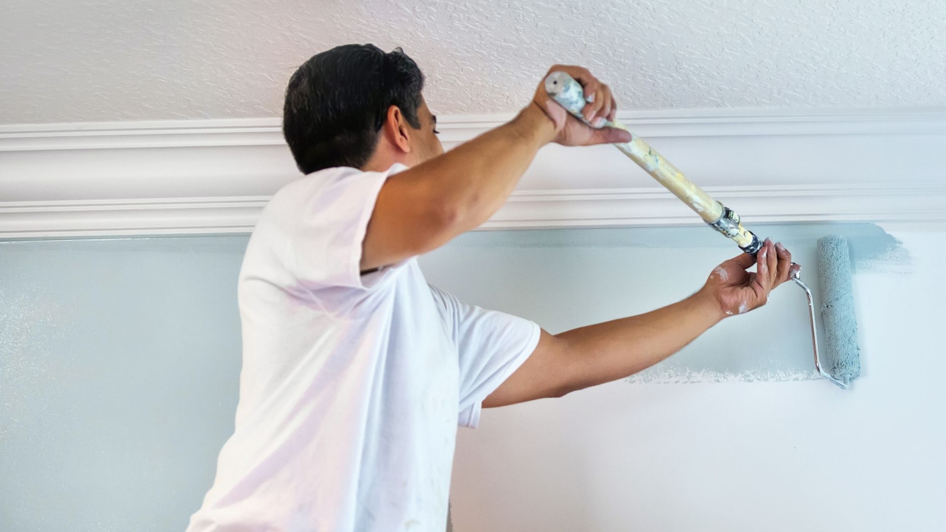
The best paint colours to use to take some thought. Most feel that white is the best colour choice because it reflects the light. If you want more than white, the popular neutral colours that will work in your small room décor are the cool and neutral shades of light blue, grey, green and taupe. Your Hamilton Paint Contractors at Penisula Paint will help your room become a space you love. Put your trust in the qualified professional painters at Penisula Painting who will use the highest quality brand name paints and materials as part of their service so you don’t have to worry about a thing. They will assist you in sharing plenty of information that will help in the refresh or update that you’re looking for. They offer a 100% customer satisfaction guarantee so you know you are making the right decision about your painting project. They know what type of paint to use that will showcase your colour choice. 


Call Penisula Painting for your free quote at 905-570-3156.


Transform your home with a stroke of excellence!


December 24, 2025
Have you ever walked into a room and immediately felt a sense of calm wash over you? Or perhaps you’ve stepped into a vibrant restaurant and suddenly felt a surge of energy? It isn’t magic. It’s colour psychology. The colours we choose for our walls do more than just look pretty. They have a profound impact on our emotions, our energy levels, and even our productivity. When you are redesigning your home, picking a shade isn't just about aesthetics; it is about deciding how you want to feel in that space. Let's dive into the fascinating world of color psychology and explore how specific hues can transform the atmosphere of your home. The Power of Cool Tones: Calm and Focus Cool colors—blues, greens, and purples—are famous for their soothing properties. They remind us of nature: the sky, the ocean, and lush forests. These are generally the best choices for spaces where you want to relax or concentrate. Blue: The Universal Calmer Blue is consistently voted the world's favorite colour, and for good reason. It is strongly associated with serenity and stability. Lighter shades of blue can make a small room feel larger and more open, mimicking the expansiveness of the sky. Where to use it: Bedrooms: Soft blues lower blood pressure and slow respiration, making them perfect for promoting restful sleep. Bathrooms: Create a spa-like retreat with aquatic tones.  Home Offices: Blue is also known as a productive colour. It encourages intellectual thought and keeps you calm during stressful workdays. However, be careful with dark, navy blues. While elegant, too much dark blue can evoke feelings of sadness or coldness if not balanced with warm accents. Green: Nature’s Neutral Green sits right in the center of the colour spectrum. It combines the refreshing quality of blue with the cheerfulness of yellow. Because our eyes don't have to adjust to see green, it is the most restful color for the human eye. It represents growth, renewal, and harmony. Where to use it: Living Rooms: Sage or moss greens encourage togetherness and comfort. Kitchens: Lighter greens feel fresh and clean, perfect for a culinary space. Reading Nooks: It reduces eye strain and promotes deep relaxation. The Energy of Warm Tones: Passion and Joy On the other side of the wheel, we have warm colours—reds, oranges, and yellows. These colours are stimulating. They grab your attention and can physically raise your energy levels. Yellow: A Splash of Sunshine Yellow is the color of optimism. It captures the joy of sunshine and communicates happiness. It is an excellent choice for brightening up dark hallways or rooms with little natural light. Where to use it: Kitchens: Yellow is often associated with food and is a great appetite stimulant. Dining Rooms: It promotes conversation and liveliness during meals. Entryways: Welcoming guests with a warm yellow creates an immediate sense of hospitality. A word of caution: Yellow is the most difficult color for the eye to process. In large doses, bright yellow can create feelings of frustration or anger. It’s often best used as an accent or in softer, buttery shades rather than neon lemon. Red: The Intensity Booster Red is the most intense colour emotionally. It pumps adrenaline like no other hue. It is associated with passion, energy, and excitement. It draws people together and stimulates conversation. Where to use it: Dining Rooms: Like yellow, red stimulates appetite and lively chat. Living Areas: A rich burgundy or terracotta can make a large room feel cozy and intimate. Red is rarely recommended for bedrooms because it can raise heart rates, which is the opposite of what you want when trying to sleep. If you love red, consider using it on a single feature wall rather than painting the entire room. Finding Balance with Neutrals White, gray, beige, and taupe are the backbone of modern interior design. While they might seem "safe," they are incredibly powerful tools for controlling mood. White: Creates a sense of cleanliness, purity, and simplicity. It’s perfect for minimalists who want a mental detox. Gray: Offers sophistication and balance. Warm grays (greige) feel cozy, while cool grays feel modern and industrial. Neutrals act as a palette cleanser, allowing your mind to rest. They also provide the perfect backdrop for your furniture and art to take center stage. How to Choose the Right Mood for Your Space Before you pick up a brush, ask yourself three questions: 1. What will this room be used for? (Sleeping, working, eating, entertaining?) 2. When is the room used most? (Morning light vs. evening lamps changes how paint looks.) 3. How do I want to feel when I'm there? (Relaxed, energized, creative?) Once you have those answers, the colour choice becomes much clearer. But even with a plan, the sheer number of paint swatches at the hardware store can be overwhelming. Is that "Cloud White" or "Dove White"? Will "Sunset Orange" look cheerful or aggressive on a massive wall? Let the Experts Guide You Getting the colour right is an art form, and getting the paint on the wall perfectly is a skill. You don’t have to navigate the complex world of undertones and finishes alone. The team at Peninsula Paint understands that painting is about more than just covering walls; it's about creating a feeling. They are experts in colour consultation and can help you select the precise shade to match your vision and your furniture. Whether you are looking for a calming sanctuary in your master suite or a high-energy creative office, they know exactly which palette will achieve your goals. Plus, they take the hassle out of the execution. Their professional painting services ensure crisp lines, even coats, and a flawless finish that DIY projects rarely achieve. Ready to Transform Your Home? Your walls are a canvas for your life. Don't settle for "builder beige" if it doesn't bring you joy. By understanding the psychological impact of color, you can curate a home that supports your emotional well-being and lifestyle. If you are ready to change your mood by changing your walls, reach out to Peninsula Paint today . Let them help you find your perfect colour and bring your vision to life.
November 30, 2025
Choosing a paint colour feels like it should be simple, but the endless rows of swatches at the hardware store can quickly become overwhelming. That perfect shade of gray on the card can suddenly look purple on your wall, and the bright, sunny yellow you envisioned might feel more like a warning sign. The truth is, selecting the right paint colour is both an art and a science. It involves more than just picking your favorite hue; it requires considering the unique characteristics of your space.  Making the right choice can transform a room from ordinary to extraordinary, affecting your mood and the overall feel of your home. We'll walk you through the key factors to consider so you can choose your next paint colour with confidence. From the amount of natural light to the room's intended purpose, each element plays a crucial role in finding that perfect shade. The Big Four of Colour Selection Before you even look at a paint chip, take a moment to assess your space. Understanding these four key factors will narrow down your options and guide you toward a color that truly works. 1. Room Size and Proportions Paint has a powerful ability to trick the eye. You can use it to make a small room feel larger or a vast, empty space feel cozier and more intimate. ● For Small Rooms: Lighter colors are your best friend. Shades of white, cream, pale blue, and soft gray reflect light, creating an illusion of openness and space. Painting the trim and ceiling a slightly lighter shade than the walls can also make the room feel taller and more expansive. ● For Large Rooms: If you have a large room that feels a bit cold or impersonal, warmer and darker colors can help. Deep blues, rich greens, charcoal grays, or even warm terracottas can absorb light and make the walls feel closer, creating a cozier, more inviting atmosphere. You can also paint an accent wall in a bold colour to add a focal point without overwhelming the space. 2. Lighting, Lighting, Lighting Light is perhaps the single most important factor in how a paint colour will look in your home. The same colour can appear dramatically different depending on the light source, which is why testing samples on your wall is so important. ● Natural Light: Consider the direction your windows face. North-facing rooms receive cool, indirect light, which can make colors appear duller or bluer. Warm colours can help balance this out. South-facing rooms get intense, bright light all day, which can make any colour look brighter and more vivid. East-facing rooms get warm light in the morning and cooler light in the afternoon, while west-facing rooms are the opposite. ● Artificial Light: The type of light bulbs you use also impacts color. Incandescent bulbs cast a warm, yellow-toned light that enhances warm colors. Halogen bulbs produce a whiter, more sun-like light. LED bulbs come in a range of temperatures, from cool to warm, so you can customize your lighting to complement your paint choice. 3. The Room's Purpose and Mood Think about how you use the room and the atmosphere you want to create. Colour has a psychological effect and can influence your mood and energy levels. ● Bedrooms: These are personal sanctuaries for rest and relaxation. Cool colous like blue, green, and lavender are known for their calming effects, making them excellent choices for a peaceful bedroom. Soft, neutral tones also create a serene environment. ● Living Rooms and Family Rooms: As social hubs, these spaces can handle a bit more personality. The color you choose depends on your desired vibe. Warm tones like beige, soft yellows, or earthy greens can make the space feel welcoming and comfortable. If you entertain often, a bolder accent wall might add energy and a conversation starter. ● Kitchens: Kitchens are often high-energy spaces. Bright, clean colors can feel refreshing. White is a classic for a reason, creating a sense of cleanliness and space. However, warm reds and yellows are believed to stimulate appetite, making them popular choices as well. ● Bathrooms: Often seen as a place to refresh and rejuvenate, bathrooms work well with crisp, clean colors like whites, soft grays, and blues. Spa-inspired palettes featuring shades of green and tranquil blue are also very popular for creating a relaxing escape. 4. Your Personal Style and Existing Decor Finally, the paint colour must work with what you already have. Unless you're starting from scratch, your furniture, flooring, artwork, and textiles will all influence your decision. Take a look at the major elements in your room. Do you have a statement piece, like a colourful sofa or a patterned rug? You can pull a colour from that item to use on your walls for a cohesive look. If your furnishings are mostly neutral, you have more freedom to go bold with your wall color. Your personal style is paramount. Are you a minimalist who loves clean lines and neutral palettes? Or do you prefer a bohemian style with rich, eclectic colors? Your home should be a reflection of you, so don't be afraid to choose a coluor you truly love, even if it breaks a few "rules." Don't Go It Alone: Expert Guidance Makes a Difference Feeling more prepared but still a little hesitant to make the final call? You're not alone. Choosing a color is a big commitment, and getting it right is important. That's where professional guidance can be invaluable. The team at Peninsula Painting doesn't just apply paint; we help you navigate the entire colour selection process. Our experts understand the nuances of how light, space, and color theory interact. We can provide personalized consultations right in your home, helping you see how different shades will look in your unique environment. We'll bring samples and offer insights to ensure the color you choose is one you'll love for years to come. Once the perfect colour is selected, our professional crew takes over. We handle all the prep work, protect your belongings, and apply the paint with precision and care, delivering a flawless finish that brings your vision to life. Let us help you transform your space with the power of color.
October 29, 2025
Tired of staring at the same four walls? A burst of color can completely transform a room, breathing new life into your space without needing a full-scale renovation. Whether you’re looking for a subtle change or a dramatic overhaul, adding color is a powerful way to refresh your home's personality. We'll explore three effective ways to do this: through accessories, wallpaper, and of course, paint. 1. Start Small: The Power of Accessories If you're hesitant to commit to a bold wall color, accessories are your best friend. They offer a low-risk, high-reward way to experiment with different shades and see what you love. This approach is perfect for renters or anyone who enjoys changing their decor with the seasons. Weave in Colourful Textiles Textiles are one of the easiest ways to introduce color. Think about adding: ● Throw Pillows and Blankets: Drape a vibrant throw over your neutral sofa or add a few jewel- toned pillows. These can be easily swapped out to change the mood of the room instantly. ● Rugs: An area rug can anchor a room and define a space with color and pattern. A bold rug can serve as the centerpiece, with other colors in the room complementing it. ● Curtains: Window treatments frame your view of the outside world, so why not make them interesting? Colorful curtains can filter light beautifully and add a soft, elegant touch of colour. Display Colourful Decor Look around your room for surfaces that could use a pop of personality. Bookshelves, coffee tables, and mantels are prime real estate for colourful objects. ● Vases and Planters: A bright ceramic vase—with or without flowers—can be a simple yet effective accent. Grouping several vases of different shapes and shades can create a compelling focal point. ● Artwork: A large piece of art can introduce a whole palette of colors. You can pull shades from the artwork to use in other accessories throughout the room, creating a cohesive look. ● Books: Don't underestimate the power of book spines. Arranging books by color on a shelf can create a stunning rainbow effect that is both personal and stylish. 2. Make a Statement with Wallpaper Wallpaper has made a major comeback, and modern designs are more beautiful and easier to apply than ever. It's a fantastic way to add pattern, texture, and a complex color story to your space. Choose Your Feature Wall You don’t need to paper an entire room to make an impact. An accent wall, also known as a feature wall, is often all you need. ● Behind the Bed: In a bedroom, the wall behind the headboard is a classic choice for a feature wall. It creates a focal point and adds a sense of luxury. ● In the Entryway: Welcome guests with a stunning first impression. A vibrant wallpaper in the foyer sets a creative tone for the rest of your home. ● Unexpected Places: Think outside the box. Wallpaper the back of a bookshelf, the ceiling, or a small powder room for a delightful and unexpected design moment. Selecting the Right Pattern The scale of the pattern should match the scale of your room. ● Large-Scale Patterns: Bold, large patterns work best in bigger rooms, where they have space to breathe. In a smaller room, they can feel overwhelming. ● Small-Scale Patterns: Delicate, smaller prints can add texture and interest without overpowering a small space. They are great for creating a cozy, intimate feel. Don't be afraid to mix patterns, but try to stick to a consistent colour palette to keep the look cohesive. If your wallpaper is busy, keep other patterns in the room more subdued. 3. Transform with Paint Paint is the most versatile and impactful tool for changing a room. The right color can alter your perception of space, influence your mood, and tie all your decor elements together. Beyond Four Walls of the Same Colour While a fresh coat of a single colour is always effective, think about more creative applications. ● The Accent Wall: This is a popular technique for a reason. Painting one wall a different, bolder colour adds depth and draws attention to a specific area of the room. It’s a great way to highlight a fireplace or a beautiful piece of furniture. ● Painted Ceilings: Often called the "fifth wall," the ceiling is a frequently overlooked surface. A soft blue can evoke the sky, while a dark, dramatic color in a room with high ceilings can create a cozy, intimate atmosphere. ● Color Blocking: Use painter's tape to create sharp, geometric shapes on your walls. You can create arches, circles, or diagonal blocks of color for a modern, graphic look. This is a great way to define a small nook or create the illusion of architectural details. Choosing the Perfect Shade Color psychology is real. Warm colors like red, orange, and yellow can make a room feel energetic and inviting. Cool colors like blue, green, and purple tend to have a calming, serene effect. Before you commit, always test paint samples on your wall. Colors can look different depending on the light in your room at various times of day. Let the Professionals Handle the Painting While adding accessories and even some wallpaper can be fun DIY projects, painting requires skill and precision for a truly professional finish. A flawless paint job sets the foundation for your entire design. At Peninsula Painting, we understand the power of colour. Our team of experienced professionals can help you achieve the look you’ve been dreaming of. We handle all the prep work, from patching holes to protecting your furniture, ensuring clean lines and a durable finish. Whether it’s a single accent wall or a complex color-blocking design, we have the expertise to bring your vision to life perfectly. Ready to transform your space with a splash of coloru? Contact Peninsula Painting today for a consultation, and let’s start planning your room’s beautiful new look.
September 30, 2025
Giving your kitchen a fresh, new look doesn't always require a full-scale renovation. If you're wondering whether your existing kitchen cupboards can be painted, the answer is a resounding yes. Painting your cupboards is a cost-effective and transformative way to update your space. With the right preparation and materials, you can achieve a durable, beautiful finish that completely revitalizes your kitchen. This guide will walk you through everything you need to know, from prepping your surfaces to choosing the best paint. We'll cover the essential steps to ensure a professional-quality result that lasts. Why Paint Your Kitchen Cupboards? Painting is a popular choice for homeowners looking to refresh their kitchen without the expense and hassle of a complete tear-out. It allows you to customize the color and style of your kitchen, whether you're aiming for a modern, classic, or eclectic look. A fresh coat of paint can instantly brighten a dark kitchen, make a small space feel larger, and increase your home's overall appeal. The Importance of Proper Preparation The key to a flawless and long-lasting paint job lies in the preparation. Skipping these crucial steps can lead to peeling, chipping, and an uneven finish. Proper prep ensures that the paint adheres correctly to the surface, creating a smooth and durable coating that can withstand the daily wear and tear of a busy kitchen. Step 1: Clean the Surfaces Thoroughly Kitchen cupboards accumulate grease, oil, and grime that can prevent paint from sticking. Before you do anything else, you must clean every surface meticulously. Use a degreasing cleaner specifically designed for kitchens. A solution of warm water and trisodium phosphate (TSP) or a specialized cabinet cleaner works well. Apply the cleaner with a sponge or cloth, scrubbing gently to remove all residue. Pay special attention to areas around the handles and stove, as these tend to be the grimiest. After cleaning, wipe the cupboards down with a clean, damp cloth to remove any leftover cleaning solution and let them dry completely. Step 2: Remove Doors, Drawers, and Hardware For the best results, you need to work on a flat surface. Unscrew all the doors from their hinges and remove all drawers from the cabinets. Take off all handles, knobs, and other hardware. Place these small pieces in labeled bags so you know exactly where everything goes when it's time to reassemble. This step prevents drips and ensures you can paint every nook and cranny without obstruction. Step 3: Sand for a Smooth Foundation Sanding is a critical step that creates a slightly roughened surface for the primer and paint to grip onto. If you skip sanding, your new paint job is more likely to peel or scratch off easily. Use a medium-grit sandpaper (around 120-grit) to scuff up the existing finish. You don't need to remove the old paint or varnish completely; you just need to degloss the surface. For flat areas, a sanding block or orbital sander will speed up the process. For detailed or curved areas, hand sanding is best. After sanding, wipe away all the dust with a tack cloth or a microfiber cloth dampened with mineral spirits. Step 4: Prime for Adhesion and Durability Primer is the bridge between the old surface and the new paint. It blocks stains, ensures even color, and provides a superior bond for the topcoat. Using a high-quality primer is essential for kitchen cupboards. Choose a stain-blocking, adhesion-promoting primer. Apply a thin, even coat to all surfaces—doors, drawer fronts, and cabinet frames. A small roller works well for flat surfaces, while a brush is better for detailed areas. Allow the primer to dry completely according to the manufacturer's instructions, which may take several hours. For an extra-smooth finish, you can lightly sand the primed surface with fine-grit sandpaper (220-grit) and wipe it clean before painting . Choosing the Right Paint Kitchen cupboards face a lot of use, so you need a paint that is tough, durable, and easy to clean. Look for paints specifically formulated for cabinets, trim, or high-traffic areas. Types of Paint to Consider ● Acrylic Enamel Paint: This is a popular choice for cabinets. High-quality water-based acrylic enamels are low-odor, dry quickly, and clean up easily with soap and water. They cure to a hard, durable finish that resists stains and scrubbing. ● Oil-Based Enamel Paint: Traditionally known for their extreme durability and smooth finish, oil-based paints are still an option. However, they have a strong odor, take longer to dry, and require mineral spirits for cleanup. ● Cabinet and Trim Paint: Many paint brands now offer specialized paints designed just for cabinets and trim. These are often self-leveling, which helps minimize brush marks, and cure to a very hard, factory-like finish. No matter which type you choose, opt for a satin or semi-gloss sheen. These finishes are easier to wipe clean than matte or eggshell sheens, which is a significant advantage in a kitchen environment. Ready for a Flawless Finish? Painting kitchen cupboards is a rewarding project, but it requires patience, precision, and a lot of detailed work. From thorough cleaning and sanding to careful priming and painting, every step is crucial for achieving a finish that looks great and stands the test of time. If you want a guaranteed professional result without the time and effort, consider hiring experts. The team at Peninsula Painting specializes in cabinet painting and can help you achieve a flawless, durable finish. We use high-quality materials and proven techniques to transform your kitchen cupboards, giving your space the beautiful update it deserves. Contact us today to learn how we can help with your kitchen project.
Man painting a white wall outdoors, wearing a red tank top, gray shorts, and black shoes.
By Daniel Zeng August 12, 2025
When is it Too Hot to Paint the Exterior of Your Home?
A woman is standing on a ladder in front of a red wall.
By Robbie Balla July 22, 2025
Choose the Right Paint for Every Room in Your Home
A man is painting a window with a brush.
By Robbie Balla June 28, 2025
Choose the Perfect Exterior Paint Color for Your Home
A living room with a couch , chair , table and paintings on the wall.
By Robbie Balla May 20, 2025
How Paint Colour Can Transform a Room
A woman is sitting on a porch painting a window.
By Robbie Balla April 22, 2025
Is Spring a Good Time to Paint the Exterior of My Home?
A bedroom with a bed , nightstand , candles and slippers.
By Sara DeSantis March 18, 2025
The Best Bedroom Colors for Restful Sleep
Show More