

How Lighting Changes Your Paint Colour
Have you ever fallen in love with a paint swatch in the hardware store, only to hate it once it’s on your living room wall? You aren't alone. The culprit is rarely the paint itself—it’s the lighting.
Light is the single most important factor in how we perceive colour. The exact same gray can look like a warm taupe in one room and a chilly blue in another. Before you commit to gallons of paint, it is crucial to understand how different light sources manipulate the hues in your home.
The Science of Light and Colour
Colour isn't static. It is a reflection of light. When light hits a surface, some wavelengths are absorbed while others are reflected back to your eye. The quality and temperature of that light determine what you see.
This phenomenon is called metamerism. It explains why your socks might match in the dim bedroom light but look like two different shades of black in the bright kitchen. When choosing paint, you are essentially choosing how that surface will interact with the light available in your space.
Natural Light vs. Artificial Light
The biggest variable in your home is the battle between the sun and your lightbulbs.
Natural Light: Sunlight is the purest form of light, showing the truest version of a colour. However, it changes constantly throughout the day and varies by season. Morning light is often cooler, while afternoon light is warmer.
- Artificial Light: Once the sun goes down, your lightbulbs take over.
- Incandescent bulbs: These cast a warm, yellow glow. They intensify reds, oranges, and yellows but can make blues and greens look dull or muddy.
- Fluorescent bulbs: Standard fluorescents emit a cool, blue light. They work well with greens and blues but can make warm colorus look washed out.
- LEDs: These are versatile and come in various color temperatures. "Warm white" LEDs mimic incandescent bulbs, while "Daylight" LEDs provide a crisper, bluer light.
How Room Direction Affects Colour
The direction your windows face dictates the type of natural light a room receives. This is often the most overlooked factor in interior design.
North-Facing Rooms
North-facing rooms receive soft, indirect light that tends to be cool and bluish. This light is consistent but rarely bright.
- The Challenge: Cool colors like blue, gray, or green can feel icy and uninviting here.
- The Fix: Counteract the coolness with warmer undertones. Choose creams instead of stark whites, or grays with beige undertones (greige). If you want a bold color, go for warmer, saturated hues to make the space feel cozy.
South-Facing Rooms
These are the darlings of the home. South-facing rooms get intense, warm light for most of the day.
- The Effect: This light flatters almost every color. Dark colors look brighter, and white looks crisp.
- The Caution: The strong light can wash out subtle pastels. It can also intensify warm colors like red or orange, making them feel overwhelming. Cool blues and greens are excellent choices here as they balance the intense warmth.
East-Facing Rooms
East-facing rooms greet the sunrise. They get bright, warm light in the morning which fades to a softer, cooler light in the afternoon.
- Morning: Warm colorus will glow.
- Afternoon: The light turns bluish as the sun moves over the house.
- The Strategy: Think about when you use the room. If it’s a breakfast nook used in the morning, a cool color can balance the intense sun. If it’s a bedroom you use mostly in the evening, you might want a warmer palette to compensate for the lack of direct sunlight later in the day.
West-Facing Rooms
The opposite of east-facing rooms, these spaces have duller morning light but receive the dramatic, warm glow of the sunset in the late afternoon.
- The Effect: The late-day sun produces a strong orange-gold cast.
- The Strategy: Be careful with red or orange paint, as the sunset light will make them incredibly intense. Cooler neutrals generally work well here to tone down the late-day heat.
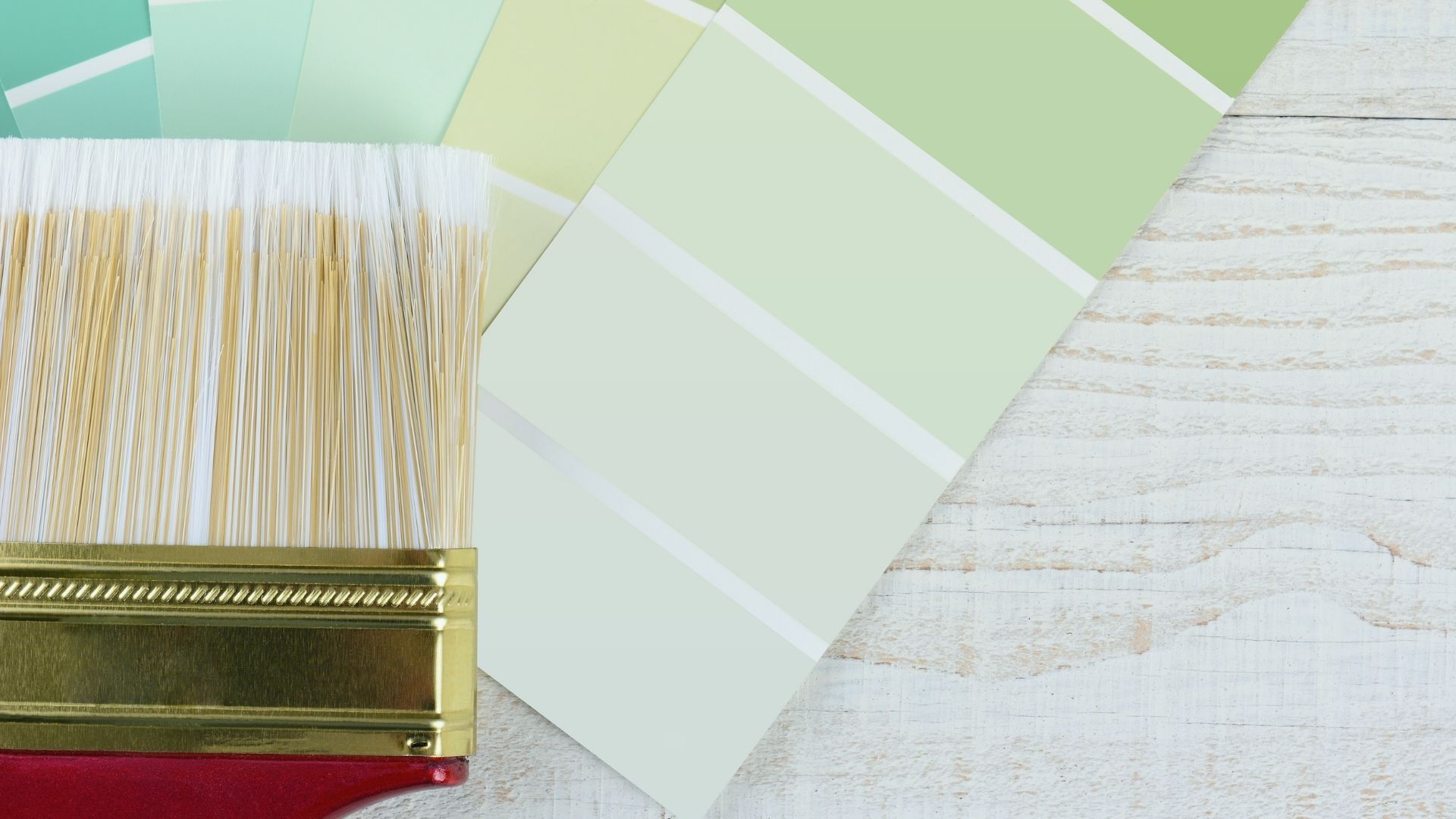
Practical Tips for Testing Paint Colors
Never trust a tiny paper swatch. To truly know how a color will look, you need to see it in your environment.
1. Use Sampler Pots
Buy sample pots of your top three choices. Do not skip this step. The small investment now saves you the cost of repainting later.
2. Paint Large Swatches
Don't paint directly on the wall. Instead, paint a large square (at least 2 feet by 2 feet) on a piece of white poster board or foam core. Do two coats for true coverage.
3. Move It Around
The beauty of the poster board method is mobility. Tape your sample to different walls. Look at it next to your furniture, your flooring, and your curtains. A color might look great next to the window but terrible in the dark corner of the room.
4. Watch the Clock
Leave the samples up for a few days. Observe them:
- In the morning with coffee.
- At noon when the sun is high.
- In the evening with your lamps on.
Does the gray turn purple at night? Does the cream look yellow in the morning?
5. Check the Finish
Remember that sheen affects colour too. Glossy finishes reflect more light and can make a color appear darker and more intense. Flat or matte finishes absorb light, making the color appear lighter and softer.
When to Call in the Pros
Understanding light reflectance values and undertones can be overwhelming. Sometimes, you need an expert eye to spot the difference between a "cool gray" and a "warm gray" before it ends up on your walls.
This is where Peninsula Painting excels. They don't just apply paint; they understand the science behind it. As a trusted partner for professional painting services, Peninsula Painting helps homeowners navigate these tricky lighting variables. Their team can guide you toward colors that will look beautiful at 8:00 AM and 8:00 PM, ensuring your home looks exactly how you envisioned it.
Lighting is the silent partner in your interior design choices. It has the power to transform a room from cozy to cold or from elegant to energetic. By understanding your room’s orientation and testing your colors under different lighting conditions, you can make confident choices.
Take the time to observe the light in your home. Test your samples rigorously. And if you need guidance on finishes, prep work, or the perfect palette, reach out to the experts at Peninsula Painting to bring your vision to life.